
Visualizing a Perceptron
A lot of machine learning techniques can be viewed as an attempt to represent high-dimensional data in fewer dimensions without losing any important information. In a sense, it is lossy compression—compressing the data to be small and amenable before being passed to some next stage of data processing. If our data consists of elements of \( \mathbb{R}^D \), we are trying to find interesting functions of the form:
where \( D \) is fixed, but \( d \) can be chosen freely. We want \( d \lt D \) and usually \( d \ll D \). If \( \matr{x} \in \mathbb{R}^D \) is a data point, then the lower dimensional representation, which I'll refer to by \( \matr{x'} \), is give by \( \matr{x'} = f(\matr{x}) \) and we have \( \matr{x'} \in \mathbb{R}^d \).
An extreme case is where we represent every data point with a single number, and so our function \( f \) is from \( \mathbb{R}^D \) to \( \mathbb{R} \). Even in this restricted setting, there is room for creativity. We could represent each data point by:
- its distance from the origin.
- deciding a neighbourhood around the data point and counting the number of other data points within it.
- choosing the average of the data point's elements, or the max, or the min.
A method that beautifully balances simplicity and flexibility is to choose a single vector and project each data point onto it. In this way, each data point is converted into a single number. If the chosen vector is denoted as \( \matr{v} \), the function \( f \) is then:
Where "\( \cdot \)" represents the dot product. Note that both \( \matr{x} \) and \( \matr{v} \) are vectors in \( \mathbb{R}^D \).
Isn't it interesting that the vector \( \matr{v} \) exists in the same space as the data points and can be chosen freely! Every choice represents a different function transforming the data from \( \mathbb{R}^D \) to \( \mathbb{R}^d \). \( \matr{v} \) could even be one of the data points. What would this mean? Or, what would it mean for \( \matr{v} \) to be the average of all the data points? In fact, a common approach to regression problems uses this exact idea! A solution is arrived at by projecting the data points onto a vector, and this vector is the weighted sum of the data! I don't explain this here, I just want to show that the simple function \( f(\matr{x}) = \matr{v} \cdot \matr{x} \) is worth exploring. In this article, we will build what is typically called a perceptron from this humble function.
For people interested in the application to regression, Andrew Ng's notes on Kernel Methods cover this idea.
\( f(\matr{x}) = \matr{v} \cdot \matr{x} \), in 2 dimensions
Below is a sequence of visualizations that try to spark some intuition for how data can be transformed by projection. First, consider the following 2D data points.
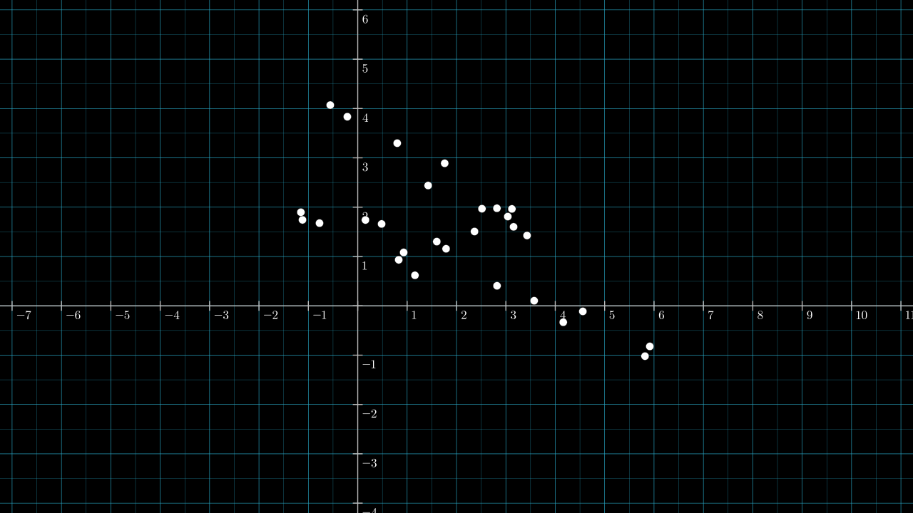
Warming up: consider projecting the data onto the two existing axes, with the first axes being the horizontal one. If \( \matr{v} \) is the unit vector lying on the first axis, \( \matr{v} = (1, 0) \), then the data is projected like so:
Similarly, if \( \matr{v} \) is the unit vector lying on the second axis, \( \matr{v} = (0, 1) \), then the data is projected like so:
In the above two videos, and in all subsequent ones, \( \matr{v} \) is shown as a white arrow. A yellow (barely yellow) number line is drawn over \( \matr{v} \) and inline with \( \matr{v} \). This number line I'll refer to as the projection number line, or just projection line. For any data point \( \matr{x_1} \in \mathbb{R}^D \), we can read off the real value \( f(\matr{x_1}) \in \mathbb{R} \) by seeing where it falls on the projection number line.
Note: in the above two figures, the ticks and numbers on the two data axes have been removed to avoid confusion with those on the projection line. This is done on many of the figures below too.
The previous two videos covered one projection each. The next video sweeps \( \matr{v} \) through all possible unit vectors.
Next we take a moment to see the data from the projection line.
What is left after the projection
When imagining these projections, it is useful to inhabit the perspective of the line receiving the points, as if ignorant of the original structure. The usefulness of this perspective is that you can better appreciate the limited information available once the points have been projected. After the projection, we will forget everything about each data point except the number along the projection line on which the point falls. After a projection, anything we might ask about a data point must be asked in terms of this number. This list of 1D points might be the only information received by the next stage of some processing pipeline, and some goals might be impossible if insufficient information is captured by the projection.
The below slightly jarring video is one visualization that might help to shift your focus to the reference frame of the projection line. Just like the video above, \( \matr{v} \) sweeps through all unit vectors, except this time, the camera is kept fixed on the projection line. Also, the original data points are given a grey color.
Having seen \( \matr{v} \) set to all possible unit vectors, an immediate question is: which ones are useful?
Choosing \( \matr{v} \)
Some values for \( \matr{v} \) definitely seem more useful than others. If we wish to have the projected points "span out" then \( \matr{v} \) pointing roughly in a south-east direction seems to be best (or pointing in the opposite north-west direction). Indeed, the south-east pointing vector \( [ 0.882, -0.472 ] \) is the first principal component of the data found by principal component analysis. The projection when we set \( \matr{v} = [ 0.882, -0.472 ] \) is shown below.
This isn't the only useful choice for \( \matr{v} \). If the data points have class labels, we may be interested in choosing a \( \matr{v} \) that keeps intact some spacial separation of the classes.
Below is the same dataset, now with labels: each point is either red or white.
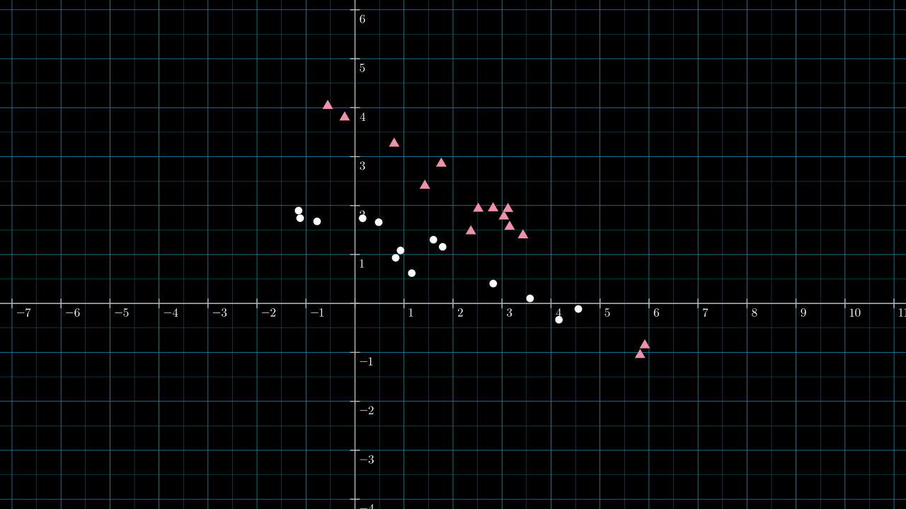
First, inspect how well the data is separated if we set \( \matr{v} \) to be \( [ 0.882, -0.472 ] \), the first principal component introduced above.
Not a very useful projection; there is no obvious pattern to the class labels once the points lie on the projection line.
For comparison, below is another sweep of \( \matr{v} \) through all unit vectors. There are clearly better choices for \( \matr{v} \) if we wish to keep the classes separated.
Using our eyes we can pick out a good a value for \(\matr{v}\). About 60° anti-clockwise from the 1st axes is the unit vector \( [0.56, 0.83] \). Setting \( \matr{v} = [0.56, 0.83] \) is one option that seems to do a good job of keeping the two classes separated. The projection is shown below. An extra dotted line is drawn perpendicular to \( \matr{v} \) and intersects \( \matr{v} \) at a point which I think splits the data nicely according to the two classes.
The intersection point is about \( 2.4 \) on the projection number line. Every point in the original \( \mathbb{R}^2 \) data space is projected onto \( \matr{v} \) either less than, greater than, or exactly equal to \( 2.4 \). Which side is determined by how the dotted dividing line cuts through the plane: every point below the dotted diving gets projected to a number less than \( 2.4 \). If we use this dividing line to predict the class of an unlabeled point, then we are utilizing the classification behavior of a perceptron.
3 parts of a perceptron
A perceptron can be fully described by 3 things. They all appeared in the above examples, although one of them was not mentioned explicitly. They are:
- a projection vector, \( \matr{v} \in \mathbb{R}^D \)
- a bias term, \( b \in \mathbb{R} \)
- an activation function, \( g : \mathbb{R} \to \mathbb{R} \)
The classifier that appeared above with \( \matr{v} = [0.56, 0.83] \)—it can be implemented as a Python function:
import numpy as np

def classify(x):
    """Classify a 2D point as either 0 (circle) or 1 (triangle)."""
    v = np.array([0.56, 0.83])
    cutoff = 2.4
    x_projected = np.dot(x, v)
    return 0 if x_projected < cutoff else 1
This function can be rewritten in a more standard way by replacing the
cuttoff term with a bias term, b = -cuttoff.
import numpy as np

def classify(x):
    """Classify a 2D point as either 0 (circle) or 1 (triangle)."""
    v = np.array([0.56, 0.83])
    b = -2.4
    x_projected = np.dot(x, v) + b
    return 0 if x_projected < 0 else 1
The perceptron's parameters are thus:
- \( \matr{v} = [0.56, 0.83] \)
- \( b = -2.4 \)
- \( g(t) = \begin{cases} 0 & \text{if } t < 0 \\ 1 & \text{otherwise} \end{cases} \)
Our activation function \( g \) is a step function. A more common activation for this binary classification problem is the sigmoid function shown below.
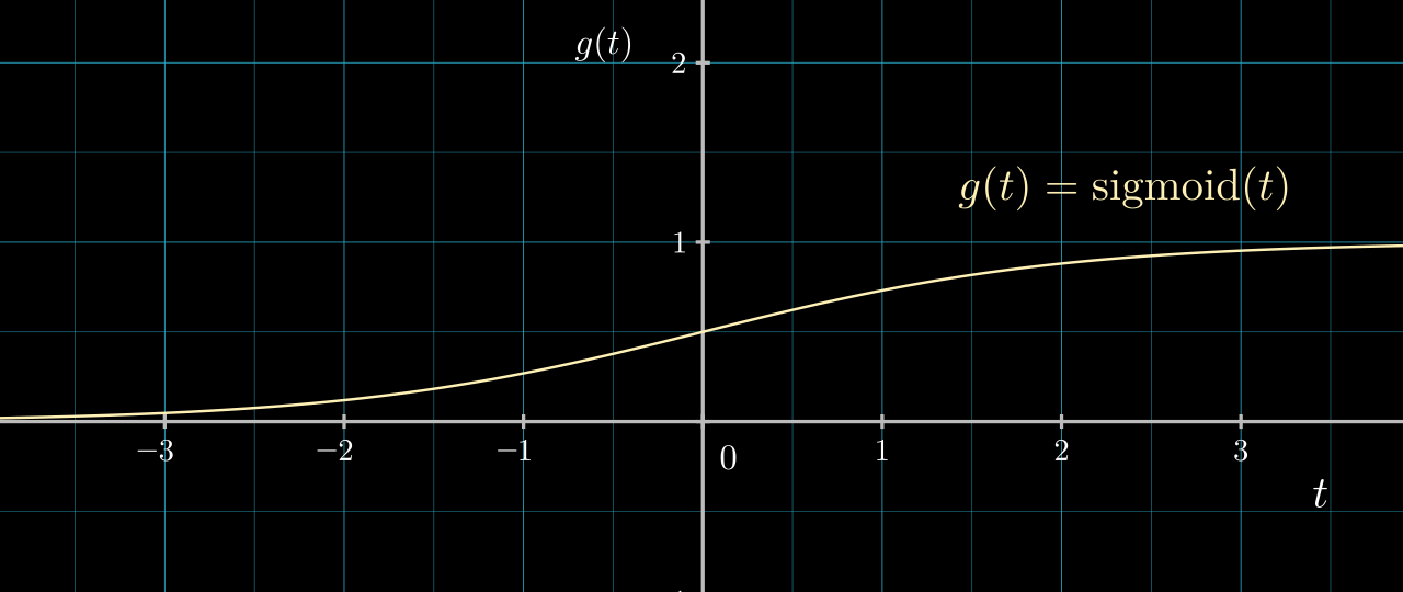
\( g \) being the sigmoid function allows the output of our classification function to communicate a sense of confidence and to be amenable to gradient based optimization. If we switch to a sigmoid activation, the code becomes:
import numpy as np

def sigmoid(t):
    return 1 / (1 + math.exp(-t))

def classify(x):
    """Estimates the probability of x belonging to class 0 (circle)."""
    v = np.array([0.56, 0.83])
    b = -2.4
    x_projected = np.dot(x, v) + b
    return sigmoid(x_projected)
Side-note: abstracting away the bias
As \( g \) is a function from \( \mathbb{R} \) to \( \mathbb{R} \), it's possible to include the effect of the bias within the function \( g \). A perceptron can then be seen as transforming \( \matr{x} \in \mathbb{R}^D \) to \( x' \in \mathbb{R} \) according to:
We are free to choose both the vector \( \matr{v} \in \mathbb{R}^D \) and the function \( g : \mathbb{R} \to \mathbb{R}. \)
Perceptrons are not typically thought of in this way; however, there is something appealing in the simplicity of viewing the datum of a perceptron as a pair: a \( \mathbb{R}^D \) vector and a \( \mathbb{R} \to \mathbb{R} \) function.
Another common conceptualization is to add an extra dimension to \( \matr{x} \) and \( \matr{v} \) and set the extra element of \( \matr{x} \) to be 1. With this, the extra element of \( \matr{v} \) has the effect of being a bias term. This approach is also appealing in its simplicity; however, I think it's harder to visualize as the data now lives in a hyperplane lifted up by a distance of 1 along a new axis.
Visualizing the effects of \( b, \norm{\matr{v}} \) and \( g \)
In the previous videos, we kept the length of \( \matr{v} \) fixed as 1 and the projection had no offset or activation function. In effect, we had \( b = 0 \) and \( g(t) = t \). Below are some visualizations of effects of individually changing \( b \), \( \norm{\matr{v}} \) and \( g \). For visualizing the effect of \( \norm{\matr{v}} \) and \( b \) we will keep \( g \) as \( g(t) = t \).
Changing \( b \)
One way of visualizing the effect of the bias, \( b \), is to translate the points after they have been projected.
An alternative visualization is to offset the number line in the opposite direction.
Changing \( \norm{\matr{v}} \) (in other words, scaling \( \matr{v} \))
Up until now, all videos had the length of \( \matr{v} \) fixed as 1, (\( \norm{\matr{v}} = 1 \)). If we are using a step function, there isn't any use of scaling \( \matr{v} \); however, in the presence of other activation functions or to allow gradient-based optimization, allowing any length for \( \matr{v} \) becomes useful.
Below are two ways of visualizing the effect of scaling \( \matr{v} \). First, we can visualize the scaling to occur to the projected points while the projection line stays fixed:
An equivalent and in my opinion a more appealing way to visualize the effect of scaling \( \matr{v} \) is to scale the number line onto which points are projected. When this is done, the lines connecting the data points to their projection stay perpendicular to \( \matr{v} \). This next video demonstrates this idea:
A note about the white arrow representing \( \matr{v} \) and its length: \( \matr{v} \) lives in the original data space; its length is determined by its length in the original data space and not by where the tip falls on the scaled projection line. As such, we should see the white arrow grow as \( \norm{\matr{v}} \) increases. The effect is a bit confusing due to the number line being overlaid over the white arrow. I considered dropping the white arrow out of this video, but maybe that would be confusing too.
Setting \( g \) to be a sigmoid function
So far the activation function \( g \) has not been explicitly shown in the visualizations. It could be argued that \( g \) does appear but as the identity function.
One way of explicitly visualizing \( g \) is to imagine the projection line to be the input domain of \( g \). In other words, the output of \( ( \matr{x} \cdot \matr{v}) \) becomes the input of \( g \). My attempt to demonstrate this is to add the output of \( g \) as a plot on a new axes.
In the below video, \( \operatorname{sigmoid}(\matr{x} \cdot \matr{v}) \) is plotted as an extra dimension. A bias shift was added to try convey some of the dynamics possible.
I didn't manage to mark on the sigmoid graph where each of the white dots land after passing through the sigmoid function. Hopefully, it's still clear what is happening.
An alternative way of conceptualizing \( g \) is to think more in terms of contours, or in terms of squishing or stretching the projection number line according to the function \( g \). For the sigmoid case, the open interval \( (0, 1) \) of the projection line gets stretched over the full length of the line. If I figure out how to plot clear contours, I might come back to this idea.
Perceptron by hand
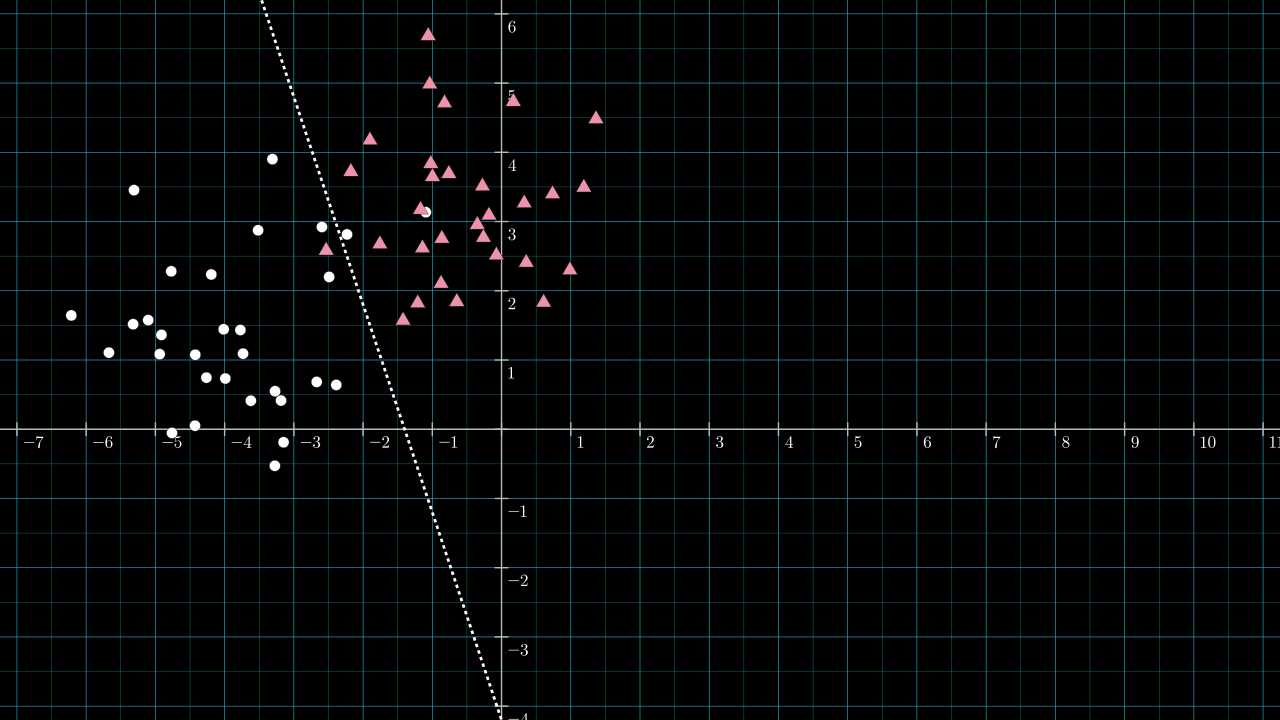
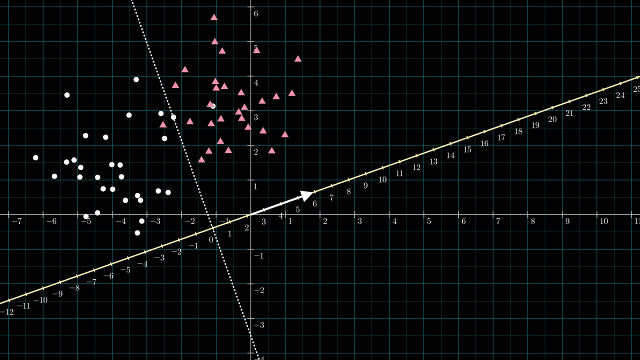
If the data is in 2 or 3 dimensions, it's not too hard to calculate by hand some good parameters for a perceptron by looking at a plot of the data. Below is some fresh data for which we will craft a perceptron to act as a classifier.
Some fresh new labeled data:
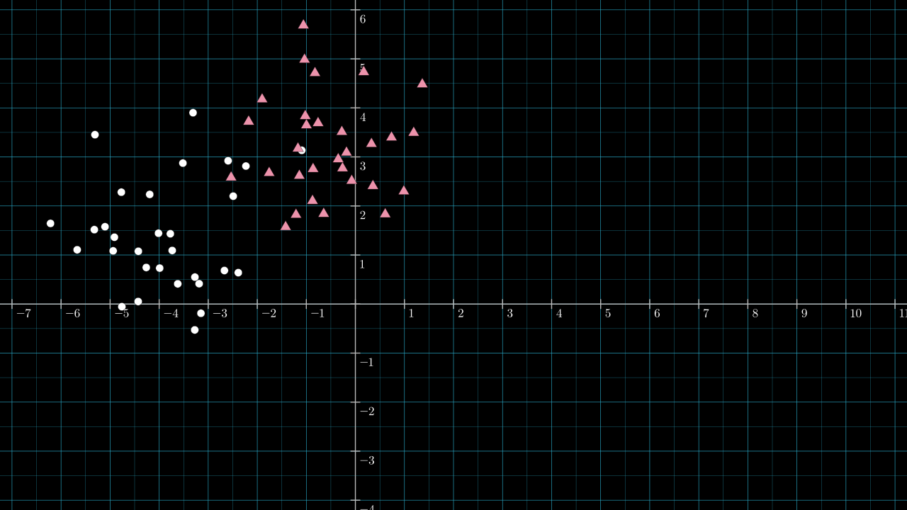
Step 1. Roughly guess the position of an effective dividing line.
Here is a line I chose by eyeballing the data.
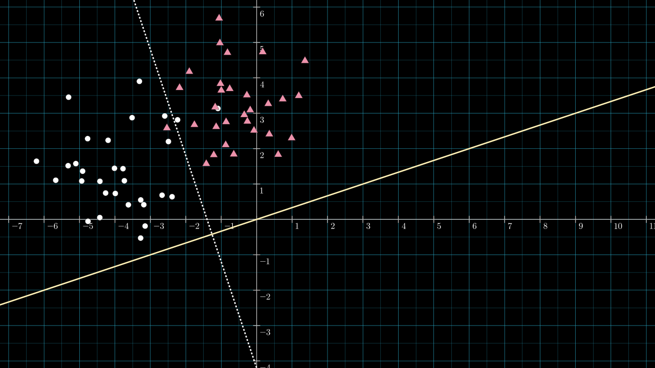
Step 2. Calculate the unique line through the origin and perpendicular to the dividing line.
The dividing line look to have a slope of about \(-3 \), so the perpendicular vector will have a slope of about \( \frac{1}{3} \). Below, the line passing through the origin with slope \( \frac{1}{3} \) is drawn in yellow.
Step 3. Choose \( \matr{v} \) to be a vector along this yellow line.
We don't need to worry too much a particular length for \( \matr{v} \). (I mention ways in which the length is important in other scenarios in a section below.) But what is important is choosing which of the two directions \( \matr{v} \) should point along the yellow line. The dividing line has split the 2D plane into two sides; which direction is chosen for \( \matr{v} \) will affect which of the 2 sides will be projected onto negative values and which will be projected onto positive values. We will be using a step activation function, and so, the side projected onto negative values will be assigned class 0 after applying the activation function.
Arbitrarily, I will designate the circles to be class 0 and the triangles to be class 1. Thus, \( \matr{v} \) needs to point in the north-east direction along the yellow line. It can be any length. I chose \( \matr{v} = [2, \frac{2}{3}] \). It has a gradient matching that of the yellow line, so it must lie on it. I didn't choose the more obvious \( [1, \frac{1}{3}] \) vector, as this vector has length so close to 1 that it's hard to make screenshots and videos that explain the situation in its full generality.
The next image includes the vector \( \matr{v} = [2,\frac{2}{3}] \), shown as the white arrow, and a scale is added to the projection line.
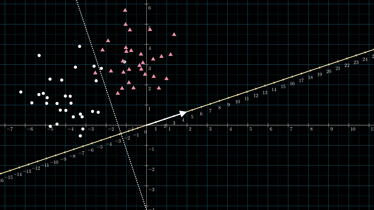
The length of \( \matr{v} \) will be a little greater than \( 2 \), \( \norm{\matr{v}} = \sqrt{2^2 + \frac{2}{3}^2} \). Because of this, the projection line is scaled and becomes denser by about two compared to the data space. If I had chosen \( \matr{v} = [1, \frac{1}{3}] \) this scaling effect would have been too small to see on the figure. Knowing the length of \( \matr{v} \) is important for choosing \( b \).
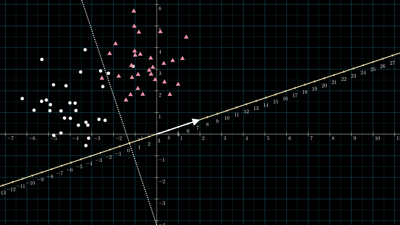
Step 4. Choose \( b \) so that the dividing line is projected to \( 0 \).
Referring to the above figure, the dotted dividing line intersects the yellow projection line at about \( -2.8 \) on the projection line. So, any point along the dotted dividing line will be projected to a value of about \( -2.8 \). We wish to use an activation function that sends all negative numbers to zero and positive numbers to 1. We can achieve this by choosing our bias to be \( b = 2.8 \). The effect is to shift the projection number line so that zero lies on the intersection point.
With the bias chosen, we have all the parameters required to implement the classifier.
Step 5. Build the classifier
The perceptron classifier is now complete. It is described by:
In Python, it can be implemented as:
import numpy as np

def classify(x):
    """Classify a 2D point as either 0 (circle) or 1 (triangle)."""
    v = np.array([2, 2/3])
    b = 2.8
    x_projected = np.dot(x, v) + b
    return 0 if x_projected < 0 else 1
The following code calculates and prints the classifier's accuracy on the training data:
# X.shape = (60, 2) and y.shape = (60,)
X,y = generate_data()
num_correct = 0
for x_i,y_i in zip(X,y):
    if classify(x_i) == y_i:
        num_correct += 1
accuracy = num_correct/X.shape[0]
print(f'Accuracy: {accuracy:.3f}')
This prints out:
Accuracy: 0.950
We can compare this result with a perceptron model trained using Scikit-learn. The following code trains a perceptron for classification using Scikit-learn and prints the model parameters and training accuracy.
import sklearn as sk

def classify_with_sklearn(X, y):
    model = sk.linear_model.LogisticRegression()
    model.fit(X, y)
    v = model.coef_[0]
    b = model.intercept_
    print(f'v: {v}, b: {b}')
    y_predict = model.predict(X)
    accuracy = sk.metrics.accuracy_score(y, y_predict)
    print(f'Accuracy: {accuracy}')

classify_with_sklearn(X, y)
This prints out:
v: [1.81096933 0.64242439], b: [2.24777174]
Accuracy: 0.95
This classifier has had \( \matr{v} \) and \( b \) set like so:
Our rough estimation for the classifier produces a very similar set of parameters to those learned by Scikit-learn, and the dividing line implied by both is almost identical.
From this exercise, it should be clear that any line we might draw to divide the plane can be implemented by choosing \( \matr{v} \) to be perpendicular to the dividing line and setting \( b \) to be the negative of the distance between the origin and the intersection of \( \matr{v} \) and the dividing line.
A note on the magnitude of \( \matr{v} \) and \( b \)
The projection vector of a perceptron trained by gradient descent will have a length dependent on factors that are not easy to consider in our rough estimate above. This applies to the magnitude of the bias value also. The loss calculation might include some regularization term that encourages a smaller projection vector and bias value, and the loss term might be targeting some probabilistic goal like maximum likelihood estimation, where the outputs of the perceptron represent probabilities.
Scaling up to neural networks
The dimension reduction transformation we have been working with:
is the building block that is repeated to create neural networks.
A neuron
The correspondence between this transformation and a typical nodal network diagram is shown below. The diagram represents the \( \matr{x} \in \mathbb{R}^D \) datum being inputted to a single perceptron.
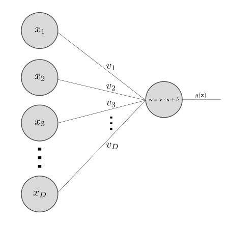
There is an extra intermediate \( \matr{z} \) variable which is just notation for \( \matr{v} \cdot \matr{x} + b\).
A layer
Next, build a whole neural network layer. As an example, consider that we have 3 transformations, \( f_1, f_2 \) and \( f_3 \), each with their own projection vectors, \( \matr{v_1}, \matr{v_2}\) and \( \matr{v_3} \) and biases, \( b_1, b_2 \) and \( b_3 \):
We can pack all of the these three transformations into matrices like so:
Which gets condensed as:
where \( \matr{V} \) is a \( 3 \times D \) matrix and \( \matr{b} \) is a 3 element vector, while \( \matr{x} \) is still the same vector in \( \mathbb{R}^D \).
It's more common to see this expression in the form:
Where the only change is to rename \( \matr{V}^\intercal \) to \( \matr{W} \) change \( \matr{x} \) to have dimensions \( 1 \times D \).
And beyond
Making layers like this and connecting them together is the fundamental idea of neural networks.